The movie theater is built in 2015 in the center of downtown. There are different kinds of tickets for audience choosing on need such as a usual ticket, group tickets and a discount ticket, etc. This product is a movie cinema app to attract and retain customers in our online system. Besides, the app is going to reserve seats for audience who likes to watch movie.
Busy workers and commuters lack the time necessary to buy movie tickets waiting in line at the movie theater in person.
Design an app for Movie Theater that allows users to easily and efficiently booking a movie.
UX designer designing an app for the Movie Theater from conception to delivery.

Conducting interviews, paper and digital wireframing, low and high-fidelity prototyping, conducting usability studies, accounting for accessibility, and iterating on designs.
I conducted interviews and created empathy maps to understand the users I’m designing for and their needs. A primary user group identified through research was working adults who don’t have time to buy a ticket waiting in line at the movie theater in person.
This user group confirmed initial assumptions about the Movie Theater customers, but research also revealed that time was not the only factor limiting users from booking a movie on the website. Other user problems included obligations, interests, or challenges that make it difficult to buy the tickets at the theater in-person.

Working adults are too busy to spend tome buying a ticket wait in line at the theater.

Website doesn’t support for discount tickets and group tickets.

Platforms for booking a movie are not equipped with assistive technologies.

Text-heavy menus in apps are often difficult to read and order from.
Problem statement:
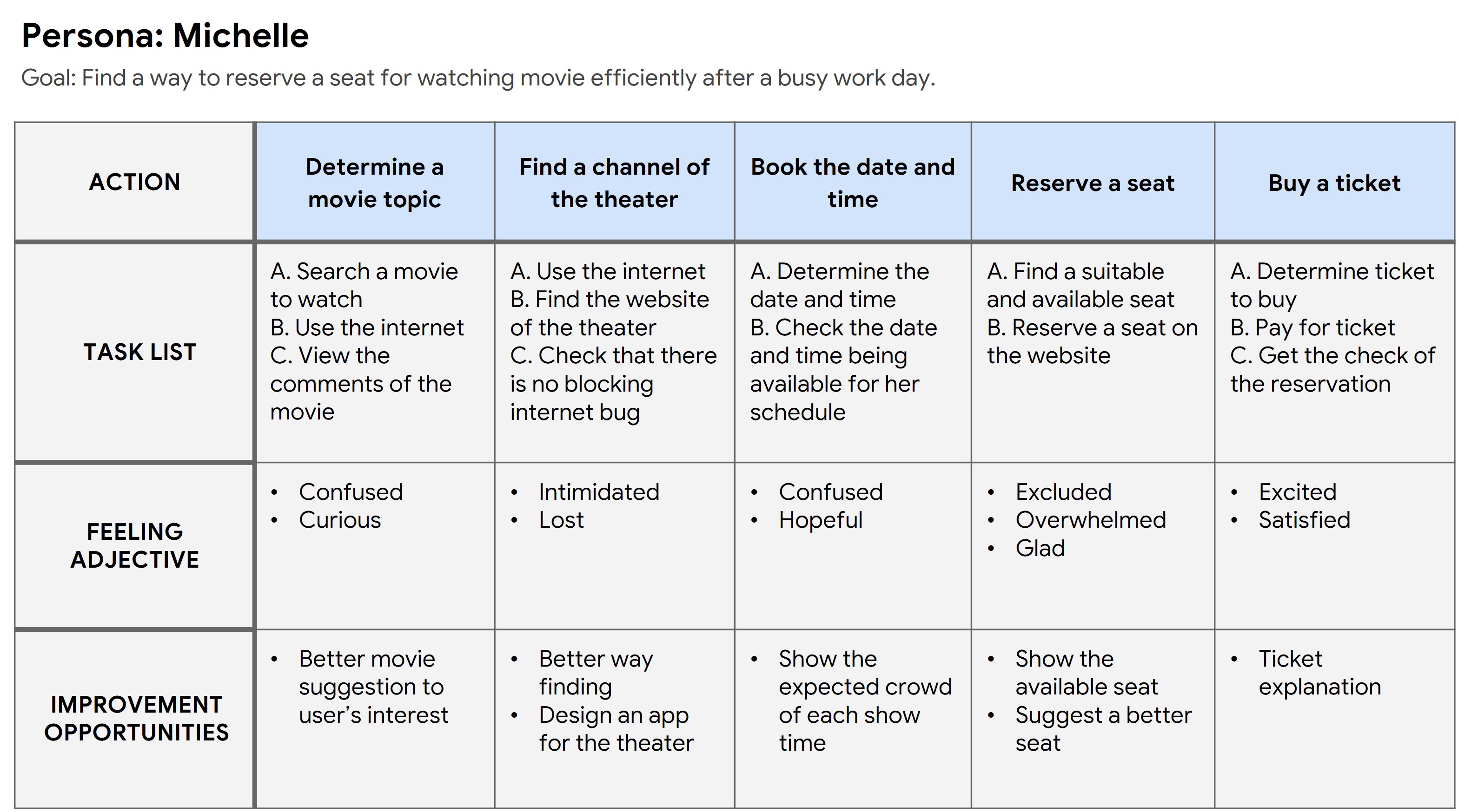
Michelle is a busy working adult who needs easy access to book a movie because she has no time to buy a ticket waiting in line at the theater.

Mapping Merina's user journey revealed how helpful it would be for users to have access to a dedicated Movie Theater app.

Taking the time to draft iterations of each screen of the app on paper ensured that the elements that made it to digital wireframes would be well-suited to address user pain points. For the home screen, I prioritized a quick and easy ordering process to help users save time.

As the initial design phase continued, I made sure to base screen designs on feedback and findings from the user research.

Easynavigation was a key user need to address in the designs in addition toequipping the app to work with assistive technologies.

Using the completed set of digital wireframes, I created a low-fidelity prototype. The primary user flow I connected was booking a movie, so the prototype could be used in a usability study.

I conducted two rounds of usability studies. Findings from the first study helped guide the designs from wireframes to mockups. The second study used a high-fidelity prototype and revealed what aspects of the mockups needed refining.
The typography of elements in the early designs is too close for comfort, but after the usability studies, I added the negative space to make visual experience better. I also revised the contrastive color to navigate users to the right destination.

The second usability study revealed frustration with the menu appearance. To streamline this flow, I consolidated the buttons below to the menu icon on the top left. Besides, I also added a new page for menu selection and made it move in animation.


The final high-fidelity prototype presented cleaner user flows for booking a movie and checkout. It also met user needs for a discount ticket or group ticket as well as more ticket types.


Provided access to users who are vision impaired through adding alt text to images for screen readers.

Used icons to help make navigation easier.

Used detailed imagery for seats and digital tickets section to help all users better understand the designs.
The app makes users feel like the Movie Theater really thinks about how to meet their needs.
One quote from peer feedback:
"The app made it so easy and fun to book a ticket! I would definitely use this app as a channel to replace the flow of buy a ticket waiting in line."
While designing the Movie Theater app, I learned that the first ideas for the app are only the beginning of the process. Usability studies and peer feedback influenced each iteration of the app’s designs.

Conduct another round of usability studies to validate whether the pain points users experienced have been effectively addressed.

Conduct more user research to determine any new areas of need.